My song chart addiction
12 March 2008
2:07 PM
A few weeks ago a new phenomenon was launched by a single chart produced in Microsoft Excel:

If you missed 2003, this chart is a reference to a song by Kelis, “Milkshake,” which spent several weeks at the top of the charts. In that song, Kelis sings:
My milkshake brings all the boys to the yard,
And they’re like
It’s better than yours,
Damn right it’s better than yours,
I can teach you,
But I have to charge
If you have only a vague idea what this milkshake might be, you can check Urban Dictionary, which tells us that milkshake means, “A girl’s body and the way she carries it.” Once you know all that, the chart is funny, no?
I thought so, as did several hundred other people, many of whom have decided to try their hand at making their own song charts. Now there’s a Flickr group dedicated to graphs and charts representing songs. In three weeks the group has accumulated 475 members and over 750 song charts. These are a few of my favorites.
 |  |
 | 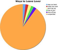 |
I think part of the humor comes from the excessive chartjunk used to represent extremely simple data. There’s also the sometimes-hilarious a-ha! moment when you get the chart you’re looking at. I played around with a few ideas and made a handful of song charts to contribute.
- Since You Went Away…
- I Know It Might Be wrong
- Effect of His Song on My Life
- Reasons To Pick Up Phone
- He’s Got Hoes
- We Can Leave Your Friends Behind
- When all you got is…
Hope you enjoy at least one of these—I covered 80s pop, 90s hip-hop, rap and rock from the 2000s, plus some Three Dog Night. I’ve been told that some of the references are obscure, especially the chart representing Men Without Hats’s hit “Safety Dance.” Let me know if you make a chart of your own.

Comments