What is bad design?
21 May 2009
11:10 AM
Bad design is ugly, it is frustrating, it doesn’t create joy, it is not well considered, but above all bad design wastes time. This isn’t to say that design is just about saving time: Good design can make you slow down, it can make you think, it can be about things besides efficiency. Good design makes you think as much as you should, but no more.
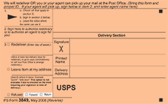
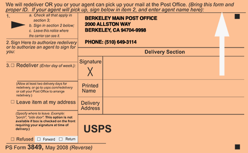
I’m writing after a particular encounter with time-wasting bad design via the U.S. Postal Service’s form 3849. When a package cannot be delivered, the mail carrier leaves a orange slip that lets you request redelivery or go to pick up the package at the post office.
My girlfriend wasn’t home when the postman came earlier this week, so I went to pick up a package for her. She signed item 2 on the form, which is labeled “Sign here to authorize redelivery or to authorize an agent to sign for you.” I went to the post office, waited an hour, presented the signed slip, and was turned away: my name didn’t appear in the space for the agent’s name. “What?” I asked, “what space for the agent’s name?” “Right here,” the clerk told me, “it clearly says to write the agent’s name right here.”
She was right. The words on the form clearly indicate that the agent’s name should be entered in the upper-right corner. The form’s visual language, however, contradicts these instructions. Once you follow the numbered list and sign in section 2, it doesn’t look like there is anything else you have to do. The space for the agent’s name is so tiny that a glance at the form would never suggest that you have to write anything there. This is bad design. Not only does it waste time because a person has to think too much about filling it out—Look at the instructions in section 1, for example, which tell you to fill out section 3, then come back to section 2—but it also wastes time when people wait in line with an improper form.
In my case, it wasted an hour. That’s bad design.


Comments