Decorating with Children's Books and a Phone Camera
6 January 2021
9:36 AM
I decorated my kids’ room with pictures from their favorite books. This is a guide in case you want to do something similar.
I started with a set of pictures frames. This way you know the number of pictures you need and the dimensions you’re working with. I picked a set of 9 frames from Home Depot: 13″ squares with an 8x8″ mat opening. I also like the HOVSTA square frames from IKEA that are 9x9″ with a 5x5″ mat.
Then I needed pictures. I picked a dozen of my daughters’ favorite books (they’re 5, 2, and 2). Ordinarily, I would use a scanner on a work copy machine but my office has been closed for months. Instead of buying a scanner, I decided to try taking pictures using my phone. I was surprised by how well this worked. To get a clean image put the book on a table or counter, use good lighting, hold the pages as flat as you can, and try to avoid reflections and shadows.
Once I had pictures on my computer I made quick, small, square crops to play the layout using Figma. Figma is a pixel-based tool so I sized everything assuming 20px per inch.
- 13″ square frame => 260px x 260px
- 1/2″ black edge => 10px border
- 8″ inner photo => 160px x 160px
I added an inner shadow on the photo to simulate a photo mat. This is completely unnecessary.
This let me plan how it would look ahead of time and make sure the photos and colors went together. Some books have beautiful pictures that just didn’t fit, like A Sick Day for Amos McGee. I also tried to arrange the pictures to minimize clashes and give some directionality: witch flying right is at the top left, Max sailing left is at the bottom right, animals going upstairs in the bottom left, etc.
My initial plan was to do all the pictures on a white background, which I think would look great—especially with more, smaller frames—but I loved the colors of the pictures and decided to keep them as-is.
Once I picked my 9 pictures, I went back to the original files to clean them up a bit. You could probably skip this step and do everything with the tools built-in at Shutterfly and friends. I I have somewhat unhealthy perfectionist tendencies so I spent a few extra hours on the images.
I used Pixelmator Pro to do some light retouching using the repair tool, curves, and sharpen. Here are the steps I used on each image:
- crop to a square (I did not resample any of the images)
- adjust the colors using ML Enhance or curves
- using the repair tool to fix any issues
- apply sharpen
- export to a JPEG
I started with Pixelmator’s “ML Enhance” auto-correct feature. Sometimes it looked great and I kept the results; other times it just looked weird (probably because illustrations in children’s books have difference color balance than you typically find in photographs).
If I wasn’t happy with ML Enhance, I adjusted the curves directly. If the picture looked washed out, I used the curve tool to set the page to white and applied a gentle S-curve adjustment to boost the contrast.
Pixelmator’s repair tool is great and it made it easy to fix wrinkles, bright spots from the photograph, and the edge of pages where I needed a little extra color. I watched this video on using the repair tool. In short, create a new empty layer, select the Repair tool, ensure “Sample All Layers” is selected, and click and drag to repair issues.
Once I had all the high-quality JPEGs, I got trial prints of a few from Mpix and Shutterfly. I was particularly interested in giclee prints and matte finishes. The prints all looked amazing; it was hard to believe the source image was a picture of a book that I took on my phone.
The deep matte finish from Mpix is gorgeous. It makes the print look more like a page from a book instead of a glossy photo print. Once I put it behind a glass frame, though, I could barely tell the difference, so I went with the cheaper glossy finish ($3.73 for glossy vs. $4.81 for deep matte at time of writing for 8”x8” prints). In retrospect, the giclee prints were probably overkill given the relatively low quality source images.
I measured and marked points on the wall to hang the frames. Our house has a mixture of drywall and lath and plaster walls and I didn’t appreciate how hard it would be to be to hang things accurately. If I had to do it again, I would probably try to create a guide on a large sheet of paper and use command strips instead of nails for hanging.
Overall I was pretty happy with the results and the girls loved the pictures when they saw the room.
Writing pull requests your coworkers might enjoy reading
26 July 2017
8:00 AM
Programmers like writing code but few love reviewing it. Although code review is mandatory at many companies, enjoying it is not. Here are some tips I’ve accumulated for getting people to review your code. The underlying idea behind these suggestions is that the person asking for review should spend extra time and effort making the pull request easy to review. In general, you can do this by discussing code changes beforehand, making them small, and describing them clearly.
At this point you may be wondering who died and made me king of code review (spoiler: nobody). This advice is based on my experience doing code review for other engineers at Twitter. I’ve reviewed thousands of pull requests, posted hundreds of my own, and observed what works and doesn’t across several teams. Some of the tips may apply to pull requests to open-source projects, but I don’t have much experience there so no guarantees.
I primarily use Phabricator and ReviewBoard, but I use the term “pull request” because I think that’s a well understood term for code proposed for review.
Plan the change before you make a pull request
If you talk to the people who own code before you make a change, they’ll be more likely to review it. This makes sense purely from a social perspective: they become invested in your change and doing a code review is just the final step in the process. You’ll save time in review because these people will already have some context on what you’re trying to do. You may even save time before review because you can consider different designs before you implement one.
The problem with skipping this step is that it’s important to separate the design of the change from the implementation. Once you post code for review you generally have a strong bias towards the design that you just implemented. It’s hard to hear “start over” and it’s hard for reviewers to say it as well.
Thoughts on one year as a parent
12 January 2016
9:00 AM
(Cross-posted from Medium, a site that people actually visit).
Around this time last year I spent a lot of time walking around, thinking about all the things I wanted to teach my daughter: how a toilet works, how to handle a 4-way stop, how to bake cookies. One year later, the only thing I have taught my daughter about toilets is please stop playing with that now, sweetheart, that’s not a toy. Babies shouldn’t eat cookies. And driving is thankfully limited to a push toy which has nonetheless had its share of collisions. On the other hand, I can recite Time For Bed and Wherever You Are My Love Will Find You from memory. Raffi is racing up the charts of our household weekly top 40. I share the shower every morning with a giant inflatable duck. It has been a challenge and yet still joyful. Here’s an assorted collection of observations and advice from someone who just finished his first trip around the sun as a parent.
I can't believe it has been a year already. Happy birthday, Sam! (cake) pic.twitter.com/ZtxvIYs222
— Ryan Greenberg (@greenberg) January 7, 2016Advice
Speaking of advice, I try not to give too much to new parents. They have surfeit of books, family, friends, and occasionally complete strangers telling them what they should and shouldn’t do. I don’t want to be one more voice in that cacophony. The first months with a new child is a struggle, and you have to do whatever it takes to get through them. Sure, there are probably some universals when it comes to babies, but as someone who has done it just once, I’m not a likely candidate to know what they are. I’m happy to tell you what I think, but only if you want to know. Let’s just assume for the rest of this article that you want to know.
Instead of "You should do this," I think much advice would be better received as "I did this, it worked for me, it might work for you."
— Ryan Greenberg (@greenberg) November 24, 2015That said, please vaccinate your kids.
Ways to communicate with me that are more effective than leaving a voicemail
6 May 2014
11:15 PM
- text message
- postal mail
- Twitter direct message
- pager
- skywriting
- interpretive dance
- smoke signals
- drunk carrier pigeon
- singing telegram
- sports arena jumbotron
- tell Suzy to tell Rachel to tell Bill to tell me
- message in a bottle thrown into ocean
- give me a telling look
- send a taxi to pick me up and drive me to the coast where a crewman aboard a ship signals using flag semaphore
- Western Union
- telepathy
Expanded from the condensed version. Hat-tip to @ravi and @av.
Arrangement in Hefeweizen No. 1
24 February 2013
2:49 PM
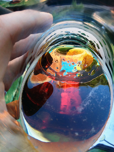
Yesterday afternoon I was out with some friends, having a beer at Jupiter, a restaurant in Downtown Berkeley. As I took a drink, I saw a beautiful colorscape at the bottom of my glass.
I looked up and realized the color was a reflection of a billboard on the side of the building, advertising the very hefeweizen I was drinking.
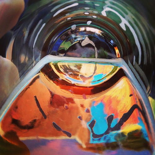
I tilted my glass and tried to get a better shot.
This one is almost unrecognizable as a glass of beer, but I love the colors.
The most dangerous part of flying
23 January 2013
9:05 AM
Pilots will tell you that the most dangerous part of flying is takeoff and landing. This is correct, though it’s most dangerous for people who aren’t busy flying the plane. Shortly before takeoff the doors to the aircraft are closed. From this point on the FAA requires passengers to shut off their electronic devices—the primary means of entertaining oneself in the 21st century—until the aircraft has reached its cruising altitude. Your Kindle off, there’s nothing to read. Your iPad off, there are no angry birds to avenge. Your eyes drift towards the seatback pocket, the only remaining source of entertainment until 10,000 feet. Safety card? Boring. Motion sickness bag? Gross. Oh, hello there, SkyMall.
There and back again
24 June 2012
1:37 PM
This is the story of how I stole my bike.
In 2008 I moved to Berkeley, California to start grad school. There are a lot of things that are nice about Berkeley, but driving is not one of them. The city makes having a car painful. Finding parking downtown is a nightmare and enforcement officers can spot an expired meter 2 miles away. Comparatively, biking is glorious. There are racks for parking everywhere. The city has designated certain streets Bicycle Boulevards, which run parallel to major streets, just a block removed from heavy traffic.
Even though I was on a student budget, I knew I wanted a bike to get around. Eventually I found my new steed, a Kona Dew Deluxe. After tax it set me back $706.86, which is a lot of money but I justified the price to myself because my last bike lasted almost 10 years.
For 36 days, life was good.
3.0 kilotweets
27 February 2012
9:17 AM
In 2007 I created my Twitter account in an Internet cafe in Santiago, Chile because I read on some blog that it was a big deal at SXSW. I spent some time deliberating between the username @ryangreenberg (which I use on a number of other services) and @greenberg. Eventually I decided on @greenberg because it seemed like being short was a big deal on Twitter. Just a few minutes ago I posted my 3,000th tweet on Twitter. Four years and a few thousand tweets later, not only am I still tweeting, but along the way I somehow ended up working for the company. What a ride.
Here’s a Harper’s Index-style look at my first 3,000 tweets:
- Number of tweets I sent between July 10, 2007 and February 27, 2012: 3,000
- Number of words written: 53,066
- Kilobytes of text: 302
- Median time between tweets: 6 hours, 43 minutes
- Average time between tweets: 13 hours, 32 minutes
- Longest time between two tweets: 84 days between tweet #1 (“Finally signing up with Twitter.”) and tweet #2 (“Wondering if there is something ironic about Superman bandaids.”)
- Most tweets in a single day: 13 on January 2, 2010, a top ten list of the best years of the decade
- Retrospectively, do I wish I sounded less whiny sometimes: a little.
- Number of URLs posted: 571
- Number of hashtags used in tweets: 155
- Number of @mentions used in tweets: 768
- Most frequently mentioned people: @MIGreenberg (40), @npdoty (36), @caitearly (21), @michaelischool (20), and @kevinweil (16).
- Number of OHs and quotes: 211
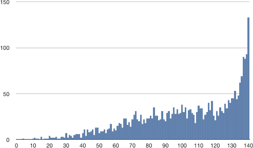
Tweet Length
- Number of tweets that are exactly 140 chars: 133 (about 4% of them)
Punctuation
- Periods: 4,705
- Single quotes, apostrophes: 1,839
- Double quotes: 1,618
- Commas: 1,560
- Colons: 1,421
- Ellipses: 143
- Em dashes: 110
- Semicolons: 71
- En dashes: 14
Topics
- Tweets that mention the New Yorker: 18
- Tweets that mention the Apple or OS X: 47
- Tweets that mention Twitter: 102
And here are a few of my favorites.
My shortest tweet—four characters—is how I let friends and family know my then-girlfriend’s response when I asked her to marry me:
Yes.
— Ryan Greenberg (@greenberg) May 23, 2009
And the next year when we tied the knot:
Hey @caitearly, I’m on campus. Let me know if you want to hang out or get married or whatever.
— Ryan Greenberg (@greenberg) October 2, 2010
A couple graduations:
It’s official: the sister is a college graduate. Congratulations!
— Ryan Greenberg (@greenberg) May 18, 2008
Graduation! Congratulations @MIGreenberg! twitpic.com/54atom
— Ryan Greenberg (@greenberg) May 29, 2011
And starting work at Twitter:
I’m going to start tweeting like it’s my job. And I’m delighted that, as of today, it is. Hi @twitter!
— Ryan Greenberg (@greenberg) June 14, 2010
I’m looking forward to the next kilotweet. If you are too, follow @greenberg over on Twitter.
FBI seizes MegaUpload, loses opportunity
23 January 2012
11:24 PM
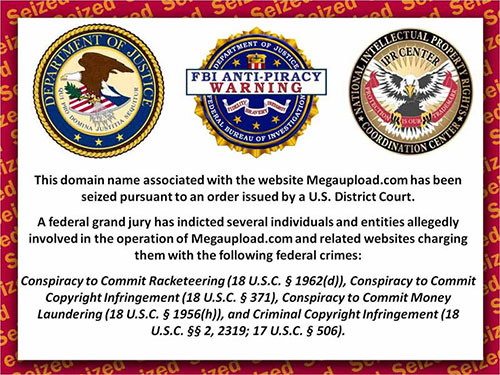
Last week the FBI seized the file exchange site MegaUpload through a court order. Previously, users could exchange files too large to email through the service. Now visitors to the site see this message:
The significance of a website seized by law enforcement is heightened in light of the controversial SOPA and PIPA legislation currently being considered in Congress. Given the high stakes—the open exchange of information in a free society, government interference with the Internet—I feel compelled to let the people at the FBI know what I think.
Guys, this is embarrassing. Really amateur hour. Seriously, look at this again:
Where have I seen a better looking image? I mean, other than every movie ever made that shows a computer screen?
I don’t even know where to start. Fine, the seals. Any one of these seals by itself is like starting the drive from your own five-yard line. The three together is handing the ball to the other team and carrying them into the end zone. You’re not into football metaphors? OK, a seal crammed full of text like “National Intellectual Rights Coordination Center” is the design equivalent of dividing by zero. All three is taking the limit of bad design as it approaches zero and it evaluates to negative infinity. Math isn’t your thing? No sweat—what I said doesn’t make sense anyway. The point is, the seals are ugly.
But they’re your logos, you say? I feel badly saying this, but they look like someone just slapped them together at 4PM on Friday after a lunchtime happy hour. Take the right one. It says, “Protection is our trademark.” I’m not a IP genius, but it seems to me like if protection really is your trademark, and you want people to take it seriously, you need to use that symbol. Like “Protection is our trademark™” or maybe “PROTECTION™”. But since you’re not actually selling anything or engaging in trade, maybe it would be more accurate to say that protection is your service mark. You don’t see that little SM enough.
As if the seals weren’t texty enough already, someone put “FBI ANTI-PIRACY WARNING” on top of the middle one. Is that part of the seal? Operating under the dubious assumption that there’s any design merit to this logo in the first place, the last thing you want to do is cover up your logo. Can you imagine Nike labeling clothes with its swoosh but then covering half of it up with “GARMENT CARE INSTRUCTIONS”?
Who picked the color scheme for the background? Had this person eaten a hot dog recently? That’s the only way I can figure it out. You can’t even read the complete word “seized” once in this tiled background.
The cited list of alleged crimes at the bottom is a nice touch, but, guys, what are we doing with the typography here? A big block of bold, italic, centered text. I read the first line and I think, “This is heavy stuff—they’re being changed with Conspiracy to Commit” and then I get confused until I realize that it’s Conspiracy to Commit … Copyright Infringement (18 U.S.C. § 371). I know how to continue reading on the next line, but you’re taking some serious liberties with awkward line breaks.
Let’s check out the source of the page:
<html>
<title>NOTICE</title>
<body>
<img src="banner.jpg"/>
</body>
</html>
No JavaScript. No AJAX. No CSS. Not even any tables. The image doesn’t have ALT tags. Maybe you’re not worried about Google indexing this page, or visually impaired people being able to read it, but I hope you realize you are just flushing the last 8 years of the Internet down the toilet. Interestingly, you went with the trailing slash that closes empty elements in XHTML but the DOCTYPE is…nothing. Whatever—this stuff is for nerds.
What we need to focus on is what a colossal missed opportunity this is for you. MegaUpload is down and the notice on the site is getting tons of exposure and when you go there it’s like you’re stuck watching the beginning of a movie forever, or at least that’s what it seems like for those people who paid for the movie and have to watch the FBI reminder to pay for the movie.
You must plan these operations, right? I mean, it’s not like you just randomly seize private property on a whim. This is a failure of project management. You can’t just bring in a designer at the last minute and expect them to polish your design turd. This is your chance to shine. Go wild. Animation, maybe a Matrix-style flow of numbers in the background. Ominous type. Here are some ideas:
- The user goes to MegaUpload. The site looks normal. Suddenly, the eagles from your logos swoop in and the cool one with the arrows in its feet starts attacking the site while the other one hangs a banner over it that says “Seized by the FBI” and then jail bars drop down over the entire site.
- The user goes to MegaUpload. The screen is filled with static like an old television. Then it looks like the screen is flipping through different TV channels. They’re all static. Finally, you get to a channel with a retro-looking message: “Seized by the FBI”. The retro part here probably plays to your design strengths.
- The user goes to MegaUpload. The site is covered with sheets of brushed aluminum that look very heavy duty. Etched into the aluminum is the message: “Seized by the FBI”.
- The user goes to MegaUpload. It says “HTTP Error 460” (this doesn’t exist—you would be making it up): “Seized by the FBI”.
- The user goes to MegaUpload. A video of Rick Astley singing “Never Going To Give You Up” starts playing. When the video finishes, it fades out and is replaced by the text “Seized by the FBI”.
- The user goes to MegaUpload. Suddenly, a S.W.A.T truck drives onto the screen. Fighter jets fly overhead. Missiles, bombs—BOOM—the screen explodes. DOM elements lie in a heap at the bottom of the screen. Smokes rises from the ashes and all of a sudden you realize it’s forming words: “Seized by the F.B.I.”
There are probably jQuery plugins that do all these effects already and you could use those as framework to build on. So dust off your copy of Photoshop. Use the mosaic filter. Add some lens flares. Watch Sneakers and Hackers and The Net and The Matrix and Tron and WarGames. Stay away from Papyrus. Then go and take down MegaUpload and put up something amazing. This is your moment: seize it.
Seen through the lens
13 September 2011
9:11 PM
I took this photo of a red panda at the San Diego zoo last month. Notice anything funny about it?
Every person looking at the panda, this photographer included, is seeing it through the lens of a camera. Or on a smartphone LCD screen. It makes you wonder why we are so intent on capturing a moment for posterity that we may never have really seen in person.


